Ferrino
The new Ferrino logo was an interesting challenge. The client needed a symbol simple enough to appear on every product, printed or embroidered, and I wanted to add an immediate connection with the outdoor/ mountain world. The F of the logotype, just rotated on an orange circle, looking like peaks in front of the sun, made the job.
![]()
I wanted the logotype very similar to the old one, so I made a minimum restyling and I changed the tilt angle as the one of HighLab, the premium brand for technical clothing.
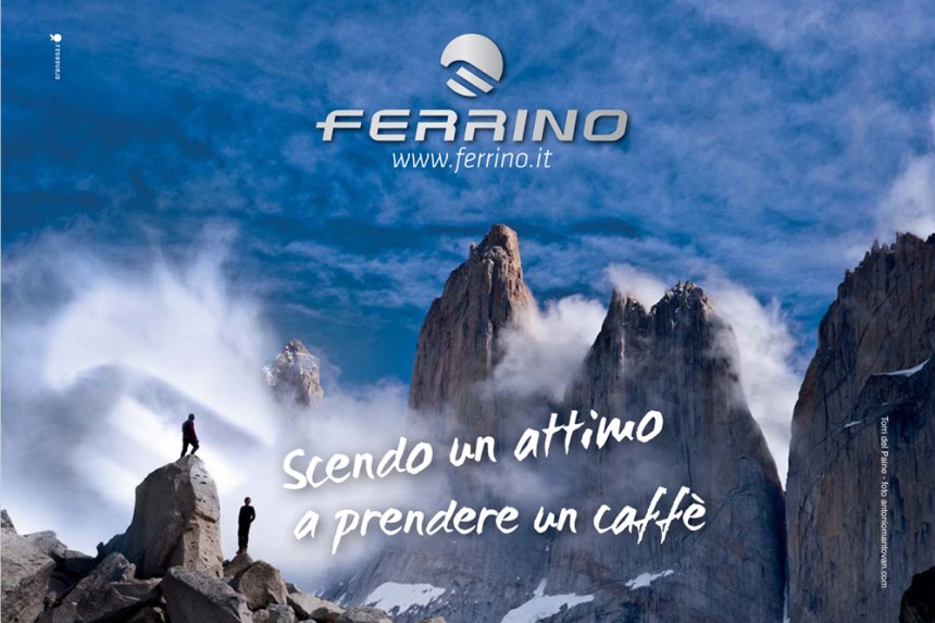
I suggested using the new symbol of the logo as part of outdoor images, as we did in this advertising page, trasforming it in a cloud by a simple postproduction,
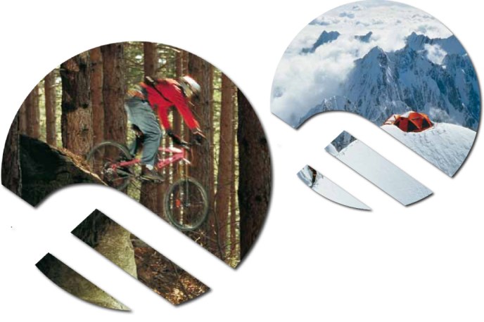
or cropping images in the same shape.
I made this work as creative director of Orange ![]() .
.


Leave a comment